Which PU Leather Bag Colours Should Buyers Plan for in 2027?
Colour planning for a bag programme is a procurement decision, not a design preference. The colours a buyer commits to determine which coated fabric the mill can run, how many material bookings are needed, what can be produced in a single dye lot, and how much stock remains unsold if a shade misses. Planning colour badly is one of the quietest ways to lose margin.
This guide sets out how a manufacturer thinks about the 2027 colour window. It is written for buyers, brand owners and sourcing teams placing PU leather bag orders from China, and it treats colour as a constrained, costed resource rather than a mood. Nothing here assumes a particular trend will win; the aim is to give a structure for making colour decisions that survive contact with production.
The planning problem has three parts. The first is understanding the direction the market is moving, so the range does not look out of date. The second is understanding the physical and commercial limits of coated fabric, so the range can actually be produced at the quantities involved.
The third is the commercial structure of the range itself: how many colours to carry, in what proportions, and how much of the budget to spend on each. The sections below work through all three and end with a practical planning routine.
| Colour group | 2027 planning role | Typical share of range | Main risk |
|---|---|---|---|
| Warm neutrals | Volume backbone | 40-50% | Shade drift between lots |
| Cool neutrals | Office and travel | 15-20% | Looks cheap if gloss is wrong |
| Earth tones | Growth group | 15-20% | Wide internal variation |
| Deep saturated tones | Seasonal driver | 10-15% | Metamerism under LED |
| Accent and metallic | Storytelling | 5-10% | High MOQ per shade |
The 2027 Colour Direction
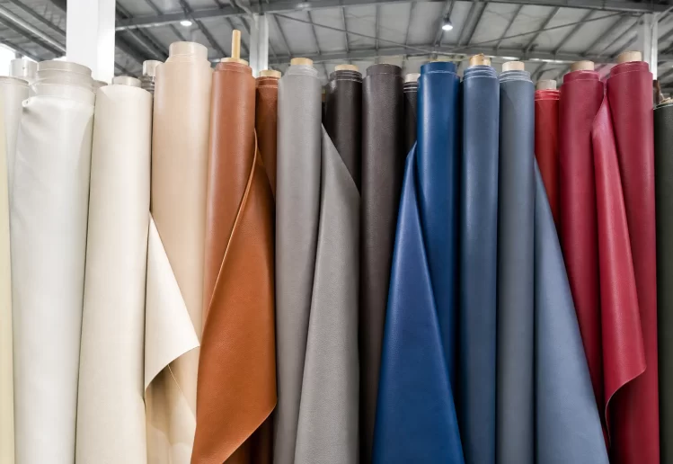
The direction moving into 2027 continues a pattern that has been visible since 2025: warm, muted and low-gloss colourways gaining share at the expense of high-contrast fashion statements. For a bag programme this is convenient, because muted colours are usually more forgiving in production and hold value longer in stock.
Warmth is still the dominant current
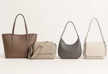
The long shift away from cool greys and blue-blacks towards browns, terracottas, warm sands and olives is still running. These tones photograph well, sit comfortably with the brown-toned packaging that brands have adopted, and read as considered rather than seasonal.
For a manufacturer, warmth is also practical. Warm browns and sand tones tolerate the slight shade variation that occurs between coating runs more gracefully than cool greys, where a small drift is immediately visible against a reference chip.
Why muted shades read as premium
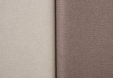
Lower saturation reduces the contrast between a coated surface and its surroundings. On PU leather that restraint avoids the plasticky look that bright saturated coatings often produce under retail lighting.
Muted depth instead of bright saturation
Where saturated colour does appear, it appears muted and deep rather than bright: burgundy, forest, deep teal, ink. These read as premium at a distance and avoid the discount-store impression that bright primaries create on coated fabric.
A muted deep shade is also easier to keep consistent, because the tolerance band around the target is wider in perceptual terms. A buyer comparing two lots of bright orange will see the difference; the same shift in a deep burgundy is often invisible.
Low-gloss finishes carrying the interest
With colour itself restrained, the differentiation moves to finish: matte, soft-touch, subtle grain and lightly brushed surfaces. This matters for buyers because finish selection is made at the same time as colour and affects the same material booking.
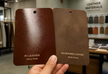
The practical implication is that the colour decision and the finish decision should be taken together. Choosing a colour swatch on a glossy card and expecting the same result in a matte finish is a common source of disappointment, because gloss changes how a colour reads under light.
What this means for a 2027 range
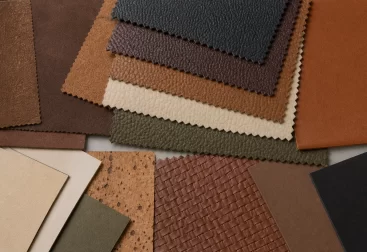
The direction suggests a range weighted towards warm neutrals and earth tones, with colour depth added through a small group of muted saturated shades and interest carried by finish rather than by brightness. That structure is defensible on trend grounds and economical on production grounds.
| Signal | Direction | What a buyer should do |
|---|---|---|
| Neutral base | Warm rather than cool | Shift the base palette warmer by one step |
| Saturated colour | Muted and deep | Limit to two or three shades, not six |
| Finish | Matte and soft-touch | Confirm colour on the intended finish |
| Contrast | Lower | Avoid hard black-and-white pairings |
| Metal hardware | Warm tones | Match hardware to the warmer palette |
| Seasonality | Longer-lived shades | Carry core colours across seasons |
Colour trends move slowly enough that the risk is rarely being early. The larger risk is committing to many shades at once and carrying the stock of the ones that do not sell.
How long a colour direction lasts
Trend direction in bags typically holds for two to three seasons rather than one. That is long enough to justify committing to a core shade and short enough that accent colours should be planned to exit.
Why Colour Costs What It Costs
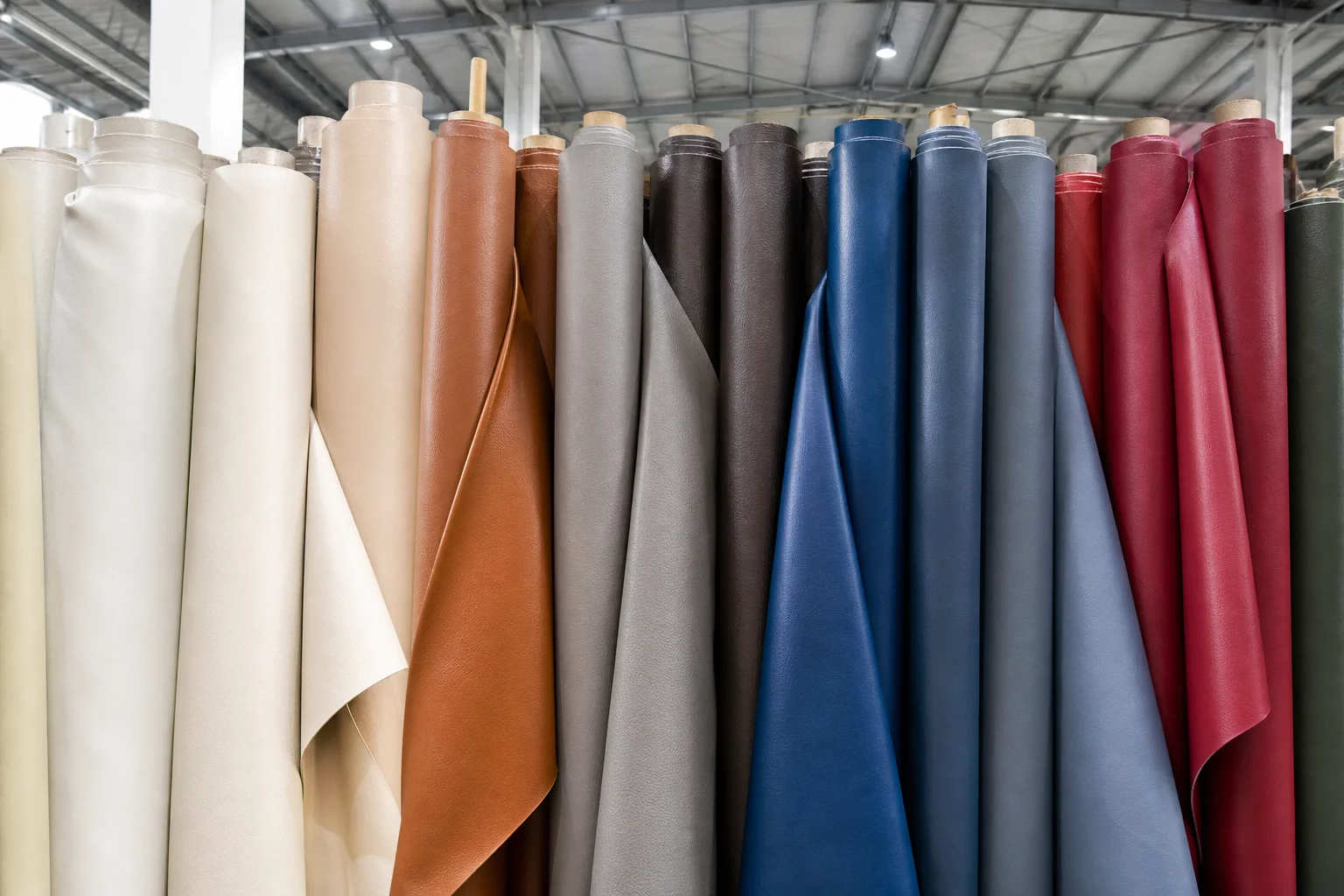
Each colour in a bag range is a separate material commitment, not just a separate specification. Understanding the cost structure explains why adding a seventh colour is rarely a marginal decision.
Every colour is a separate coating run
Coated fabric is produced in runs, and a colour change means cleaning down and resetting the line. Short runs therefore carry a disproportionate share of the changeover cost, and a colour ordered in small quantity is expensive per metre for reasons that have nothing to do with the pigment.
The practical consequence is that the cheapest range to produce is the one with the fewest distinct colours at meaningful volumes. Spreading a fixed budget across many colours reduces the volume behind each and raises the unit cost of all of them.
Minimum order quantity applies per colour
Material MOQs are quoted per colour and per finish, not per order. A buyer who splits an order across eight colours may find that each colour falls below the mill’s minimum, which forces either a surcharge or a different supplier.
Where the minimum cannot be met, the usual outcomes are an increase in quantity beyond what is needed, a price premium for short runs, or a change to a shade the mill already holds in stock. All three constrain the range more than the original colour plan assumed.
| Colour count in a range | Effect on material MOQ | Effect on unit cost | Effect on stock risk |
|---|---|---|---|
| Three colours | Comfortably above minimum | Lowest | Low, but few options |
| Five colours | Generally above minimum | Moderate | Manageable |
| Seven colours | Some near the minimum | Rising | Noticeable per-shade risk |
| Ten colours | Several below minimum | High, with surcharges | High, many slow shades |
| Fifteen colours | Most below minimum | Highest | Severe tail risk |
Dye lot matching constrains the range
Where a range is restocked, the new material must match the previous lot closely enough to be sold alongside it. A colour that is hard to reproduce consistently is therefore a recurring cost, not a one-off, because every restock risks a visible mismatch.
Low-gloss muted shades are generally easier to reproduce within tolerance than high-gloss saturated ones. This is one reason the market direction towards matte and muted colours is commercially convenient rather than merely aesthetic.
Why gloss changes perceived colour
A glossy surface reflects more of the light source and reads darker and more saturated than a matte surface of the same pigment. Approving a colour across finishes without checking both invites a mismatch.
Metamerism makes colour a lighting question
Two samples can match under one light source and differ under another. This effect, metamerism, is common with coated fabrics and matters because bags are viewed in daylight, in retail spotlights and under LED at home.
Where a colour is prone to metamerism, the approval should be carried out under more than one light source, and the shade should be checked against the retailer’s own lighting if it can be obtained. Approving in a single lighting condition is how a colour that looked correct in the sample room looks wrong in the shop.
Why the sixth colour is the expensive one
The first few colours absorb the fixed costs of the range and are produced at sensible volumes. Each additional colour adds changeover, adds minimum quantity exposure and adds stock risk, while its marginal sales contribution is usually smaller than the one before.
| Cost element | Driven by | Behaviour as colours are added |
|---|---|---|
| Coating changeover | Number of colour runs | Rises with each added colour |
| Material minimum | Quantity per colour | Worsens as budget is split |
| Lab dip approval | Colours x rounds | Multiplies with range size |
| Cutting and sorting | Colour separation on the line | Rises with colour count |
| Stock carried | Slow-moving shades | Grows faster than range size |
| Markdown risk | Unsold seasonal shades | Concentrated in the tail |
The cost of being early
Committing to a direction before the market confirms it means carrying stock that must be discounted. A two-season lag is usually safer than being first, because the second season confirms the first.
Building the Core Colour Range
The core range is the part of the palette expected to sell across seasons and to carry most of the volume. Getting it right matters more than getting the accents right, because the accents are optional and the core is not.
Start with three volume colours
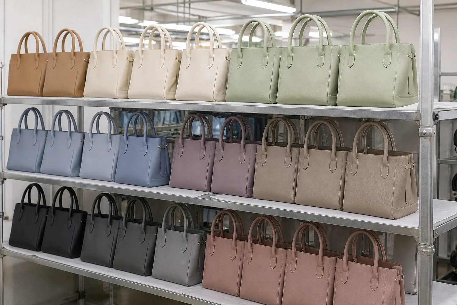
A workable core is three colours that between them cover the main use cases: a warm neutral for general retail, a dark shade for professional and travel use, and a mid-tone for the seasonal story. These three should be expected to carry the majority of units.
Keeping the core to three also makes it possible to commit real volume to each, which is what brings unit cost down and what makes restocking straightforward. It is the single most effective structural decision in colour planning.
Choose shades that tolerate variation
Within each role, prefer shades with a wide perceptual tolerance band. Muted browns, warm sand, deep navy and soft charcoal all absorb small production drift without looking wrong, whereas a precise fashion shade does not.
The test is straightforward: if a two-step shade shift in either direction would be accepted by the customer, the shade is a good core candidate. If either direction is unacceptable, the colour belongs in the accent group where volume is low.
Confirm the finish before approving the colour
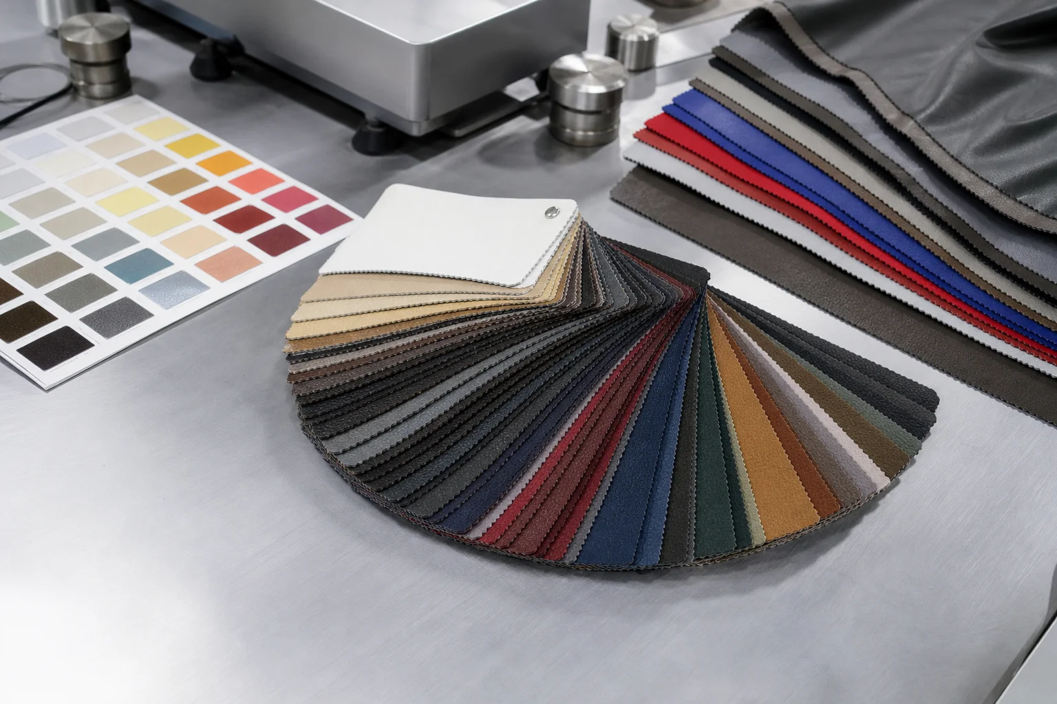
Approve the colour on the finish that will actually be used. A swatch read on a semi-gloss board will not predict the appearance of the same pigment in a matte or soft-touch coating, and the difference is often large enough to change the decision.
This means the lab dip request must specify the finish, the grain and the substrate, not just the colour reference. Requests that omit these details are the most common reason a colour is approved twice.
Decide the hardware and lining early
Hardware plating and lining colour change how the outer colour reads. A warm brown outer with cool silver hardware and a grey lining looks markedly different from the same outer with antique brass and cream lining.
| Core role | Candidate direction | Why it holds | Suggested share |
|---|---|---|---|
| Warm neutral | Sand, camel, warm taupe | Sells year round, tolerates drift | 20-25% |
| Dark professional | Deep brown, charcoal, ink | Travel and office demand | 15-20% |
| Seasonal mid-tone | Olive, terracotta, clay | Carries the season story | 10-15% |
A core range of three colours with real volume behind each will usually outperform a range of eight colours bought in small quantities, at lower cost and with less stock risk.
When a colour is worth a premium
A colour justifies a premium where it is difficult to reproduce and the customer specifically wants it. Where the shade is available from several mills, the premium is unlikely to hold beyond the first season.
Accents, Metallics and Seasonal Shades
Accent colours exist to give the range a story and to refresh a shop floor without replacing the core. Their value is disproportionate to their volume, and so is their risk.
Keep accents to two or three shades
Two or three accents are enough to refresh a range. Beyond that the accents begin to compete with each other, and the shop floor becomes harder to merchandise coherently rather than easier.
Each accent should have a clear role: one that lifts the core palette, one that speaks to the season, and optionally one that serves a specific channel or customer segment. Accents without a defined role tend to remain unsold.
Limit accents to shared trims and shared shapes
The most economical way to run an accent colour is to apply it to a bag shape that also exists in a core colour, using the same trims, hardware and lining. This means the only additional commitment is the outer material in the accent shade.
Accents that also require new hardware plating, new lining and a new shape multiply the commitment across several materials at once, which is how a small colour addition becomes a large cost.
Metallics need special handling
Metallic and pearlescent finishes behave differently in production from solid colours. Coverage is less even, orientation of the effect can create visible directionality in the finished bag, and the appearance is more sensitive to gloss and lighting.
| Accent type | Typical role | Production consideration | Suggested share |
|---|---|---|---|
| Muted saturated solid | Seasonal lift | Easy to run, moderate MOQ | 3-5% |
| Deep jewel tone | Premium story | Metamerism risk under LED | 2-4% |
| Soft metallic | Festive or gifting | Directional effect, tighter QC | 2-3% |
| Pearlescent | Point of difference | Coverage variability | 1-2% |
| Printed or embossed effect | Signature look | Tooling or print setup cost | 2-4% |
Decide what happens to the accent afterwards
An accent colour planned as a one-season shade should be planned to exit. That means agreeing the exit point in advance, holding a limited quantity, and not restocking it once the season closes.
Where an accent performs unexpectedly well, the decision to promote it into the core should be deliberate and made between seasons, not by quietly reordering it as stock runs down. Promotion without a plan usually leaves the buyer holding material that no longer fits the palette.
Setting a written tolerance band
The tolerance band should state the acceptable shift in each direction, the lighting conditions for checking and the reference retained by both parties. Ambiguity here is the most common cause of lot rejection.
Neutrals and the Long-Life Palette
Neutrals do more commercial work than any other group. They carry repeat purchase, they are the safest basis for a private label launch, and they are the colours most likely to be reordered without a new material booking.
Distinguish warm from cool deliberately
Warm and cool neutrals are not interchangeable and should not be treated as such. Warm taupes and sands sit with the current palette and the brown-toned packaging many brands use; cool greys read differently and suit a more formal, technical positioning.
Carrying both is possible but expensive, because each neutral is another colour run. A range should normally commit to one neutral temperature and build around it, adding the other only where the customer base genuinely splits.
Black is a colour, not a default
Black performs well in professional and travel categories, but it is also the shade where finish and gloss show most clearly. A matte black and a glossy black are effectively different products, and both are unforgiving of surface defects.
Because black is so widely held by mills, it is often available with the shortest lead time and the least minimum-quantity friction. That availability is a real planning advantage and worth accounting for when building the palette.
| Neutral | Best suited to | Restock ease | Notes for planning |
|---|---|---|---|
| Warm sand | Lifestyle and retail | Good | Pairs with the current warm palette |
| Camel | Premium lifestyle | Good | Forces coordination with trims |
| Warm taupe | Broad retail | Good | Forgiving of shade drift |
| Cool stone | Office and minimal | Moderate | Looks poor if gloss is wrong |
| Charcoal | Professional | Good | Softer than black on the shelf |
| Navy | Travel and office | Moderate | Depth varies between mills |
| Black | Universal | Easiest | Shows finish and defects clearly |
Neutrals and repeat purchase
Customers who buy a bag in a neutral shade are more likely to buy the same shape again in a different size than to switch colour. Neutrals therefore support range depth rather than colour breadth.
Use neutrals as the basis for private label
For a first private label range, neutrals allow a brand identity to be carried by hardware, stitching, lining and labelling while the outer material stays within readily available shades. This reduces MOQ exposure and shortens development.
It also means the launch range can be extended later without renegotiating the material platform. A brand that launches on three neutrals can add an accent in the second season without changing its core supplier relationship.
Why accent colours exit
Accents are planned to run out because their appeal is tied to a season and a story. Carrying them into the next season weakens the reason they were chosen and adds a shade the range did not budget for.
Planning a Colour Calendar
Colour decisions have lead times that most buyers underestimate, because the colour itself is the last thing to be confirmed and the first thing to be needed.
Work backwards from the shelf date
Lab dips, approval rounds, material booking and coating runs all sit in front of production. A colour that is approved late compresses the material lead time and pushes the whole order, which is why colour approval belongs early in the calendar rather than at the end of sampling.
The practical rule is that colour should be frozen before the production booking is confirmed, not alongside it. Where a shade is still open when production is scheduled, the schedule is not real.
Build in an approval round for the finish
Because colour is approved on a finish, and finishes are often confirmed late, a second approval round is common. Planning one round of slack for colour into the calendar is realistic; planning for one round only is optimistic.
| Stage | Typical lead time | Colour dependency |
|---|---|---|
| Palette shortlisting | 2-3 weeks | Colour references issued |
| Lab dip submission | 1-2 weeks | Requires colour and finish |
| Dip review and revision | 1-3 weeks | Commonly two rounds |
| Material booking | 1-2 weeks | Colour must be frozen |
| Coating run | 2-4 weeks | Per colour, per finish |
| Production | 3-5 weeks | Material must be in house |
Decide restock colours before the season opens
Knowing in advance which colours will be restocked and which will run out protects both the calendar and the cash position. Restock colours should be the ones with the widest tolerance band and the strongest sell-through.
Colour is the cheapest thing to change on a drawing and one of the most expensive to change on a production line. Treat every colour decision as a material commitment.
Colour decisions after production starts
Once coating has begun, colour changes become expensive and slow. Any revision at that point affects material already committed, so colour questions should all be closed before the first run starts.
Colour Planning Mistakes
The errors below account for most of the avoidable cost in bag colour programmes. Each is common enough to be worth checking against a live range before the order is placed.
Building the range from a trend report
A trend palette describes a mood, not a production plan. Adopting the whole of a published palette ignores minimum quantities, changeover costs and the tolerance behaviour of coated fabric, and produces a range that is expensive to make and hard to restock.
The correct use of a trend report is to inform the direction and then to select a small number of shades that can be produced at volume and reproduced reliably. The report narrows the choice; it does not make it.
Approving colour on the wrong substrate
Approving a colour on a paper swatch or a competitor’s bag rather than on the intended coated fabric and finish is a reliable route to a rejected production lot. The substrate changes the appearance as much as the pigment does.
Approval should always be on a dip made with the production coating on the production substrate, in the correct finish and grain. Anything else is an approximation, and approximations are where disputes begin.
Confusing colour count with range size
A range can look broad while carrying only five colours if the shapes, sizes and finishes are varied. Conversely a range of five shapes in twelve colours looks deep but behaves as twelve separate material commitments.
| Mistake | Consequence | Prevention |
|---|---|---|
| Too many colours | High unit cost, slow shades | Cap core at three, accents at two or three |
| Colour approved late | Compressed material lead time | Freeze colour before booking |
| Wrong approval substrate | Rejected lots, rework | Approve on production fabric and finish |
| No tolerance agreed | Disputes over acceptable shade | Define a tolerance band in writing |
| Single-light approval | Metamerism surprises in store | Check under two light sources |
| Accents with no exit plan | Dead stock at season end | Agree the exit before ordering |
| Restocking without review | Palette drifts from plan | Review restocks between seasons |
| Ignoring hardware and lining | Colour reads differently than approved | Approve the full combination |
Not agreeing a tolerance
Every colour has an acceptable range around the target, and if that range is not agreed in writing the judgement falls to whoever inspects. A written tolerance makes inspection objective and prevents a lot being rejected on a subjective reading.
The tolerance should be expressed in a way both parties can apply, with the reference retained by both. Where an instrument reading is used, the reference and the reading conditions belong in the specification.
Ignoring the lighting of the sales channel
A shade that reads well in the factory may read poorly under the warm spotlights of a physical store or under the cool LED of a home. Where the sales channel is known, approval should account for its lighting environment.
Reviewing colour performance after the season
Comparing sell-through by colour at season end shows which shades earned their place. That record is the most reliable basis for the next palette, more so than any forecast.
FAQ
How many colours should a PU leather bag range carry?
For most ranges, three core colours carrying the volume and two or three accents carrying the seasonal story. That structure keeps each colour above material minimums and limits the number of shades that can end up as slow stock.
Which colours are expected to matter most in 2027?
Warm neutrals and earth tones, with depth added through a small group of muted saturated shades such as burgundy, deep olive and ink. Bright saturated primaries are not the direction, and interest is carried by matte and soft-touch finishes.
Why does adding one more colour cost so much?
Because each colour is a separate coating run with its own minimum quantity, its own lab dip rounds and its own stock exposure. The sixth colour carries changeover and minimum-quantity costs while typically adding less sales than the colours before it.
Can colour be approved from a paper swatch?
A paper swatch can narrow the choice but should not be the basis of approval. The colour must be approved on a dip made with the production coating on the production substrate, in the correct finish and grain.
What is metamerism and why does it matter for bags?
Metamerism is when two samples match under one light source and differ under another. It matters because bags are seen in daylight, under retail lighting and under home LED, so a shade approved under one light can look wrong under another.
Should a range carry both warm and cool neutrals?
Usually only one, because each neutral is another colour run. Carrying both is justified only where the customer base genuinely splits between a warm lifestyle palette and a cool formal one.
When should colour be frozen in the order calendar?
Before the production booking is confirmed. Lab dips, approval rounds and coating runs all sit in front of production, so a shade still open when production is scheduled puts the whole delivery date at risk.
How should restock colours be chosen?
Choose the shades with the widest tolerance band and the strongest sell-through, and decide them before the season opens. Restocking shades outside that group is how a palette drifts away from its plan.
Do metallic finishes behave like solid colours?
No. Coverage is less even, the effect can show directionality across a panel, and appearance is more sensitive to gloss and lighting. Metallic finishes need tighter inspection criteria and a smaller planned share of the range.
Is black a safe default for a first range?
It is convenient because mills hold it, so lead times are shorter and minimum quantities are easier to meet. It is also the finish that shows surface defects most clearly, so it demands good quality control.
How many lab dip rounds should be planned for?
Plan for two. One round is possible where the colour reference and finish are unambiguous, but a second round is common because the finish is often confirmed after the colour is first requested.
How can a buyer reduce colour cost without losing range appeal?
By reducing the number of colours and increasing the depth behind each, varying shapes and finishes instead of shades, applying accents to existing shapes with shared trims, and keeping the core on shades that tolerate production drift.
Planning a 2027 colour range?
Send your palette and target quantities to info@gionar.com and we will confirm achievable shades, material minimums per colour and the lead time for the range.