- Why Logo Method Is a Strategic Choice
- Embroidery on Bags
- Screen Printing and Pad Printing
- Heat Transfer, Foil and Sublimation
- Debossing, Embossing and Laser Engraving
- Woven Labels, Patches and Plates
- Comparing Every Method
- Preparing Artwork for Each Method
- Cost, MOQ and Tooling
- Placement and Brand Consistency
- Quality Control of Logo Application
- Common Branding Mistakes
- FAQ
Why Logo Method Is a Strategic Choice
The method you choose to put your logo on a bag decides how it looks, how long it lasts and how much it costs per unit. It also decides what your brand feels like in the customer’s hand.
The mark the customer actually touches
A logo on a bag is encountered in use rather than in an advertisement. It is seen when the bag is opened, carried and set down, which makes its execution a direct brand experience rather than a decorative detail.
That is why method matters more than size. A small, crisp deboss on a leather tab reads as considered; a large, slightly crooked print reads as careless — and the difference is process, not design.
Three variables that decide the method
| Variable | Question to answer | Effect |
|---|---|---|
| Durability | How much contact and abrasion? | Printing vs embroidery vs deboss |
| Volume | How many units per run? | Tooling and MOQ viability |
| Perception | What price tier is the bag? | Method vocabulary and finish |
Answering those three questions narrows the field quickly. A high-contact area on a premium bag ordered in small quantities points to debossing or a metal plate; a large colour logo on a low-cost promotional item points to printing.
Where branding budgets go wrong
The common mistake is choosing the method on price alone and discovering the durability problem afterwards. A print on a bag’s most-touched surface can wear away within a season, which damages the brand more than the saving is worth.
The second mistake is applying many methods across a range for variety. Each additional method adds tooling, suppliers, lead time and inspection criteria, and the brand story becomes harder to control rather than richer.
Embroidery on Bags
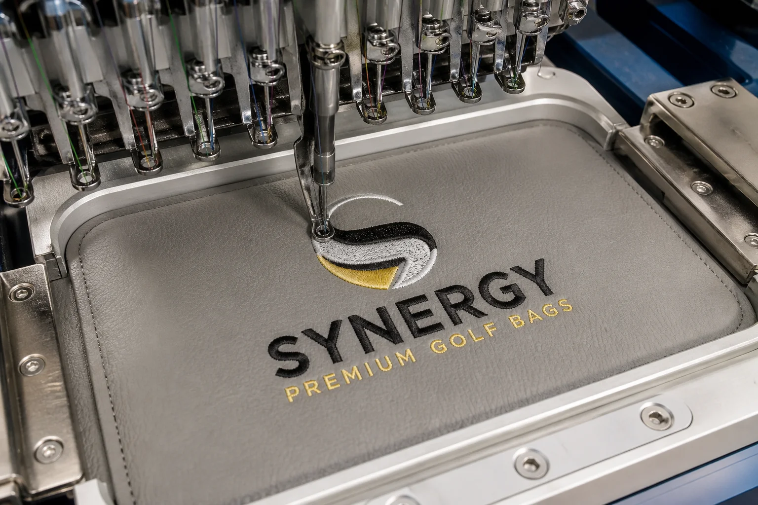
Embroidery applies thread to the surface in a digital pattern, producing a raised, tactile mark. It is the leading logo method for fabric bags and works well on many PU leather surfaces with the right backing.
How embroidery works
The logo is digitised into a stitch file that the machine reads. Stitch direction, density, underlay and thread colours are all set in the file, and the quality of that digitising determines the result more than the machine does.
On bags, embroidery usually needs a stabiliser behind the panel so the stitches do not pucker the material. On PU leather, a suitable backing also protects the surface from the needle.
Strengths of embroidery
Embroidery is durable under abrasion, dimensionally stable and available in multiple thread colours including metallic and specialty threads. It also reads as craftsmanship, which suits premium positioning.
It needs no per-piece tooling beyond the digitising file, so small runs are practical and reorders carry no new setup cost.
Limits of embroidery
Fine detail is the constraint: small text, thin lines and gradients either disappear or fill in, so logos must be simplified for stitching. Dense artwork also stiffens the panel, which can matter on soft bags.
PU leather is less forgiving than fabric because needle perforations are permanent. A poorly digitised design can leave visible holes or a distorted surface that cannot be repaired.
Stitch types worth specifying
| Stitch type | Used for | Character |
|---|---|---|
| Satin stitch | Letters, borders | Smooth, dense, raised |
| Fill stitch | Large solid areas | Economical, slightly heavier |
| Run stitch | Fine lines, outlines | Light, quick, low coverage |
| Appliqué | Large shapes | Fabric base plus stitched edge |
| 3D foam | Raised branding | Foam core, pronounced relief |
Specifying stitch types in the branding brief gives the digitiser a target and gives you a basis for rejecting a sample that uses the wrong treatment.
Screen Printing and Pad Printing
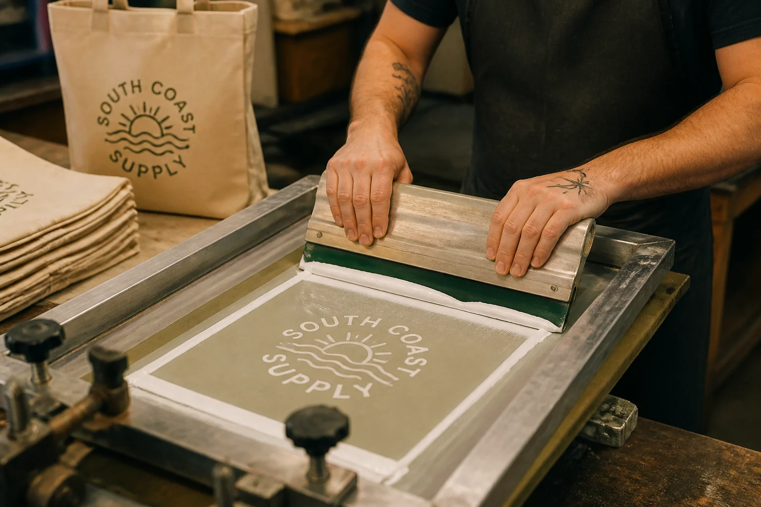
Printing applies ink to the surface, producing a flat mark with no added weight or thickness. It is the most economical method for simple logos at volume and the most colour-flexible for large artwork.
How screen printing works
A mesh screen is created for each colour, and ink is pushed through the open areas onto the material. The print is then cured, usually with heat, so that it adheres and resists rubbing.
On bags, screen printing suits flat panels and works well on coated fabrics and on some PU leather finishes. Each additional colour means an additional screen and an additional pass.
Strengths of screen printing
Screen printing delivers strong, opaque colour on dark materials, covers large areas economically and handles bold graphics that embroidery cannot. Setup is inexpensive compared with tooling.
At volume, the per-unit cost is the lowest of any method, which is why it dominates promotional and entry-price products.
Limits of screen printing
Durability under heavy abrasion is the main weakness: prints on high-contact surfaces can crack, fade or peel over time, especially where the material flexes. Curing quality and ink choice decide how long it lasts.
Fine detail and gradients are also limited. Halftones and photographic artwork require special handling and rarely match the quality of a transfer or a woven label.
Ink types and their behaviour
| Ink | Best for | Notes |
|---|---|---|
| Plastisol | Fabric, cotton canvas | Durable, opaque, standard |
| Water-based | Soft hand-feel | Softer, less opaque on dark |
| UV / UV-cured | Coated and PU surfaces | Fast cure, good adhesion |
| Silicone | Technical textiles | Flexible, high stretch resistance |
| Pad printing ink | Small parts, curved areas | For pads and small hardware |
Ink choice is a technical decision that should be written into the specification. The same artwork printed in different inks produces noticeably different durability and feel.
Pad printing for small and curved areas
Pad printing transfers ink from an engraved plate via a soft silicone pad, which lets it print onto small or curved surfaces. It is the usual method for marking bag hardware, closures and small trim parts.
Its limit is size: pad printing suits compact marks, not large graphics, and the artwork must be simplified for the transfer.
Heat Transfer, Foil and Sublimation
Transfer methods apply a pre-made graphic to the surface with heat and pressure. They handle artwork that printing and embroidery cannot, and they are the standard route for fine detail and metallic finishes.
Heat transfer vinyl and transfer film
A design is cut or printed onto a carrier film, positioned on the bag and pressed with heat. The film releases the graphic into or onto the material, and the carrier is peeled away.
The method handles fine lines, small text and multi-colour artwork far better than screen printing. It also suits small runs, because there is no screen or mold to make.
Foil stamping and metallic effects
Foil stamping presses a metallic or coloured foil onto the surface with a heated die, producing a sharp, bright mark that reads as premium. It is common on leather-look panels and on premium packaging.
The die is the tooling cost, and it typically supports one colour and one shape per pass. Foil can scuff under heavy abrasion, so it works best on visible but lightly handled areas.
Sublimation and dye-based transfers
Sublimation turns ink into gas that bonds into suitable synthetic surfaces, producing a mark that cannot be felt. It is excellent on polymer-coated materials and on light-coloured substrates.
Its constraint is material compatibility and colour base: sublimation needs a receptive surface and generally works on light backgrounds rather than dark ones.
Strengths and limits in one view
| Method | Strength | Limit |
|---|---|---|
| Heat transfer | Fine detail, full colour | Adhesion depends on material |
| Foil stamping | Premium metallic look | Scuffs; single colour per pass |
| Sublimation | Permanent, no hand-feel | Light synthetics only |
All three need a test on the actual material before production. Transfer adhesion varies dramatically between finishes, and a sample press is the only reliable way to confirm it.
Debossing, Embossing and Laser Engraving
These methods change the material itself rather than adding something to it. They produce subtler, more permanent branding and are the natural choice for leather-look and premium products.
Debossing and embossing
Debossing presses the logo into the surface so it sits below the surrounding material; embossing raises it. Both use a heated die and pressure, and both produce a mark that cannot peel or wash off.
On PU leather the result depends on the material’s backing and thickness: a good deboss is crisp and slightly darker in the recess, while a poor one looks shallow or drags at the edges.
Laser engraving
A laser removes or alters a thin surface layer to create the mark, achieving fine detail without a physical die. It is well suited to short runs and to artwork that would be impractical to cut as a die.
The result is permanent and precise, though on some coated materials the laser reveals the backing colour, which can be an asset or an unintended contrast depending on the design.
Choosing between them
| Factor | Deboss / emboss | Laser engraving |
|---|---|---|
| Tooling | Die required | File only |
| Detail level | Moderate | High |
| Look | Tactile, traditional | Crisp, technical |
| Short runs | Costly | Efficient |
| Surface effect | Compressed recess | Layer removed or altered |
Both methods share one rule: test on the exact material. Coating thickness, backing and colour all change the result, and a mark that looks excellent on one PU leather can look weak on another.
Where these methods belong
Use them on premium bags, on leather tabs, on interior areas read at close range and wherever permanence matters most. They also combine well: a debossed tab with an embroidered accent gives depth and colour in one small area.
They are less suited to very large logos, because the die size and the pressure required grow quickly, and to materials too thin to hold a clean impression.
Woven Labels, Patches and Plates
Attached components carry the logo as a separate element: a woven label, a leather or PVC patch, a metal plate. They allow branding methods that the bag material itself cannot accept.
Woven and printed labels
A woven label integrates the design into the weave, giving fine detail and durable colour; a printed label applies the design to a base fabric. Both are usually folded or looped into a seam.
Labels are the standard for interior branding and for care information. They are inexpensive, consistent and easy to reproduce, which makes them the safest primary mark in a manufacturing sense.
Leather, PU and PVC patches
Patches are stitched onto the surface and can themselves be branded by debossing, embroidery or printing. A debossed PU patch is a common way to place a leather-look mark on a fabric bag.
The patch’s own attachment is a quality point: it must be stitched with enough security for the load the area sees, and its edges must be finished so they do not fray.
Metal plates and hardware marks
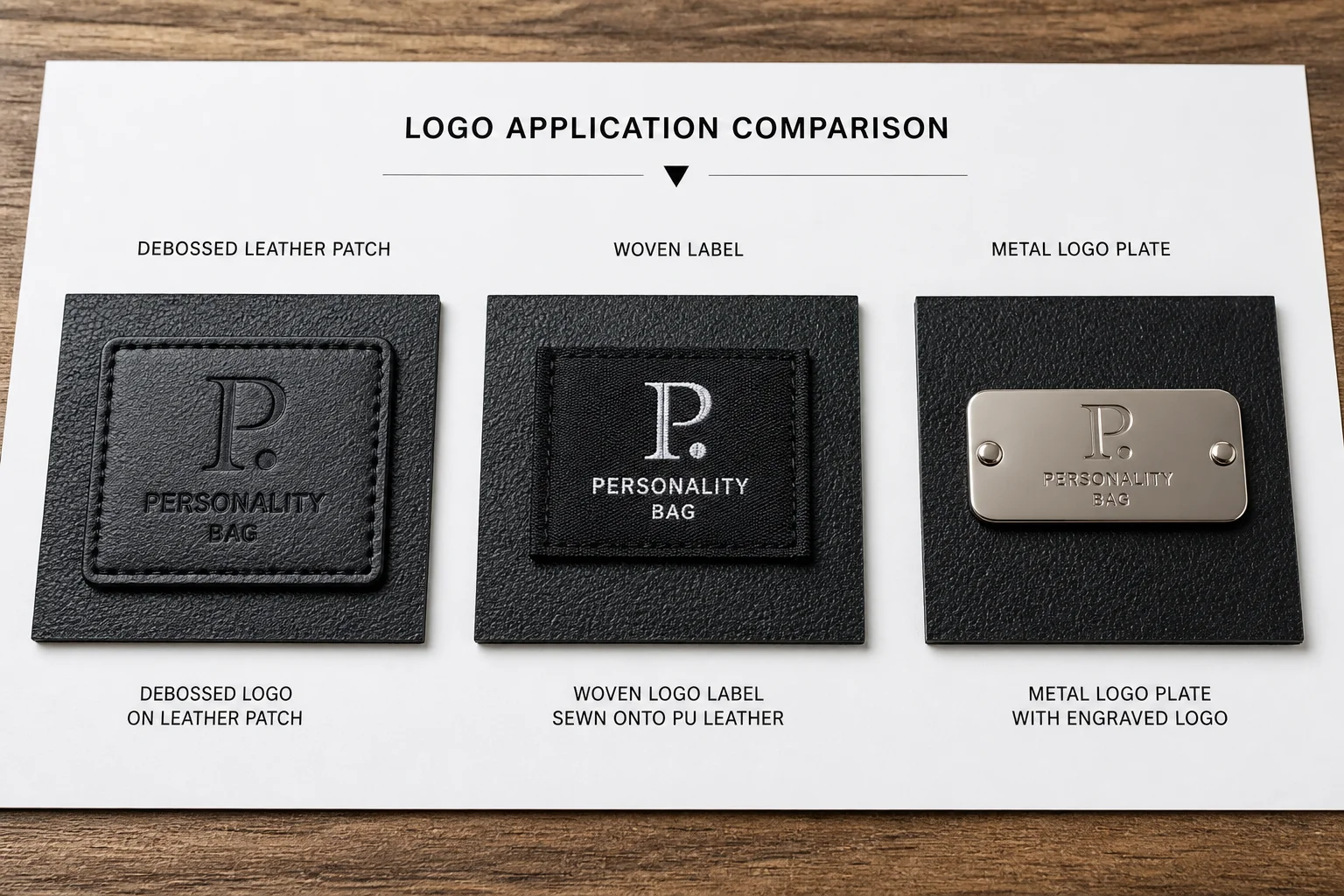
Metal plates and engraved hardware give the most durable and most premium-feeling mark, and they are covered in detail in our guide to custom hardware branding. Their cost and MOQ follow the tooling route.
They belong on the bag’s most visible and most touched positions, where the investment in tooling is repaid by the impression the mark makes every day.
Combining components
A single bag might carry a debossed exterior patch, a woven interior label, a metal pull and a care label. Each element has a different job, and together they form the branding system rather than a single mark.
Design the system deliberately: one primary mark, one interior mark, one durable hardware mark. More than that usually adds cost without adding recognition.
Comparing Every Method
With each method’s mechanics understood, the practical comparison is durability, detail, colour capability, tooling and cost. Reading across those rows usually settles the decision.
The master comparison
| Method | Durability | Detail | Colours | Tooling | Best for |
|---|---|---|---|---|---|
| Embroidery | Very high | Medium | Multi | Digitising file | Fabric bags, caps, premium canvas |
| Screen printing | Medium | Medium | Per screen | Screens | Bold flat logos at volume |
| Pad printing | Medium | Medium | Per plate | Plate | Small curved parts, hardware |
| Heat transfer | Medium-high | High | Full colour | None | Fine detail, small runs |
| Foil stamping | Medium | High | One per pass | Die | Metallic premium marks |
| Deboss / emboss | Very high | Medium | None | Die | Leather-look, premium tabs |
| Laser engraving | Very high | High | None | File only | Fine detail, short runs |
| Woven label | High | High | Multi | Weave setup | Interior marks, care labels |
| Metal plate | Very high | High | Finish options | Mold | Primary exterior mark |
The table shows a clear division: added-element methods (embroidery, labels, plates) are durable and permanent, while applied-ink methods (printing, transfers) are cheaper but more wear-sensitive.
Matching method to price tier
| Price tier | Typical branding system |
|---|---|
| Entry / promotional | Screen print plus printed care label |
| Mid-market | Heat transfer or embroidery plus woven label |
| Premium | Deboss, foil or metal plate plus woven label |
| Luxury | Debossed patch, metal hardware mark, woven interior label |
Buyers who match the method to the tier avoid the two extremes: a premium price with a promotional-looking logo, or an entry product carrying tooling the volume cannot support.
Rejecting a method quickly
Screen print fails on fine detail and on very high-contact surfaces; embroidery fails on small text; foil and sublimation fail on incompatible materials; deboss fails on material too thin to hold the impression; metal plates fail on low volume.
Checking those five failure conditions against the brief removes most of the options in a few minutes, which is faster than evaluating each method in full.
Preparing Artwork for Each Method
Branding problems often originate in the artwork rather than the process. Each method has its own constraints, and preparing files to those constraints is cheaper than correcting a sample.
Vector files and simplification
Supply vector artwork wherever possible, with outlined fonts and a single-colour version available. Outlined text avoids font substitution errors, and the single-colour version is what most processes actually need.
Then simplify for the method: reduce fine lines, remove gradients for stitched and die-based processes, and increase contrast for marks read at a distance or in shadow.
Line weights and minimum sizes
| Method | Practical minimum |
|---|---|
| Embroidery text | Letter height about 4–5 mm |
| Screen print line | Line width about 0.3 mm |
| Heat transfer detail | Lines down to about 0.2 mm |
| Deboss line | Line width about 0.5 mm |
| Laser engraving | Lines down to about 0.1 mm |
| Woven label text | Letter height about 2 mm |
Treat the figures as starting points and confirm them with the supplier for the actual material. Thickness, coating and colour all shift the practical limit.
Colour specification
Specify colours by reference rather than by name, and accept that some methods cannot match the reference exactly — thread, ink, foil and dye all render colour differently on different surfaces.
Ask for a physical colour proof where the brand colour is critical. Screen colours and monitor colours are not a reliable basis for approving a production run.
File handover discipline
Send one current file per logo per method, with a version number and a clear file name, and state which is approved. Multiple versions circulating by email is the most common cause of a wrong mark in production.
Include the placement instruction with the artwork rather than in a separate message, so the file and its position cannot be separated.
Cost, MOQ and Tooling
Branding cost has three components — setup, per-piece application and quality risk — and their balance changes with volume far more than the headline price suggests.
Setup versus per-piece cost
Embroidery digitising, screen making, die cutting and label weaving are all setup costs. Printing, stitching and pressing are per-piece costs. Low-volume orders are dominated by setup; high-volume orders by the per-piece rate.
This is why the cheapest method at 500 units is rarely the cheapest at 5,000, and why a brand should re-evaluate its branding method as volumes change.
Typical cost structure by method
| Method | Setup | Per piece | Volume fit |
|---|---|---|---|
| Embroidery | Low (file) | Low-mid | Small to large |
| Screen printing | Low (screens) | Lowest | Medium to large |
| Heat transfer | Very low | Mid | Small to medium |
| Foil stamping | Mid (die) | Low-mid | Medium to large |
| Deboss die | Mid (die) | Low | Medium to large |
| Laser engraving | None | Mid | Small to medium |
| Woven label | Mid (weave) | Low | Large |
| Metal plate | High (mold) | Low at scale | Large |
The pattern is that tooling buys down the per-piece price. Choosing a tooled method at a volume that cannot amortise it is the most common branding budget error.
Minimum order implications
Label weaving and metal plates typically carry the highest minimums, embroidery and transfer the lowest. For an opening order, a transfer or embroidered mark is often the only practical route.
Ask for the minimum per method before finalising the artwork, since the answer can change which method is viable at all.
Placement and Brand Consistency
Where the logo sits is as important as how it is made. Placement decisions are what turn several branded products into a recognisable brand.
Choosing the primary position
Front centre is the most conventional and the easiest to reproduce; a corner position feels more modern and leaves the centre free for design features. Either works, provided the choice is consistent across the range.
Consider how the bag is carried. A logo on the front panel is visible when the bag is held, while one on the side gusset is only seen when the bag is set down.
Secondary and interior marks
Secondary marks include the interior label, a branded zip pull and a small mark on the strap or base. They reward the customer who looks closely and reinforce that the product is considered throughout.
Interior marks also carry the information that cannot fit outside: the brand name in full, the series and the care instruction. Their role is informational as much as decorative.
Documenting placement precisely
Record the position as a measured offset from a named reference — for example “centre of front panel, 35 mm below the top edge” — and attach a photograph of the approved sample with the position marked.
A measured position is checkable; “centred on the front” is not. The measurement is what allows an inspector to reject a misplaced logo objectively.
Scale and proportion
Logo size should relate to the panel, not to the logo’s own importance. A mark that fills a small pocket looks cramped while the same mark on a large tote looks considered.
Set a minimum and maximum size for each product type in the brand guidelines and test both extremes at actual size before committing the artwork to a die or a screen.
Quality Control of Logo Application
Branding quality is measurable, and checking it prevents the most visible category of defect on a finished bag. The checks differ by method but follow the same principle.
Inspecting printed and transferred marks
Check registration between colours, sharpness at the edges, ink coverage and adhesion. A rub test on a sample reveals whether the ink or transfer will survive contact in use.
Reject marks that are misaligned on the panel, off-colour against the approved proof, or inconsistent in density between pieces of the same batch.
Inspecting stitched and debossed marks
For embroidery, check the stitch count, the density, puckering around the mark and the trim of the thread ends. For debossing, check the depth, the edge crispness and the absence of drag marks around the die impression.
Both methods also require a placement check on the finished product, because a correct mark in the wrong position is still a defect.
The application inspection checklist
| Check | Applies to | Failure looks like |
|---|---|---|
| Position and alignment | All | Off-centre or tilted mark |
| Size against approved artwork | All | Scaling error on the die or file |
| Colour against proof | Print, transfer, thread | Wrong shade or density |
| Edge sharpness | Print, deboss, laser | Bleed, drag, weak impression |
| Adhesion or depth | Print, transfer, deboss | Peeling, shallow recess |
| Panel distortion | Embroidery, deboss | Puckering or stretched material |
| Thread or edge trim | Embroidery, labels | Loose ends, frayed patch edge |
Using one checklist across methods keeps the inspection standard consistent and makes the results comparable between suppliers and production runs.
Sealing the approved reference
Keep a sealed approved sample with the branding clearly visible, and photograph it. Every later shipment is compared to that reference rather than to a memory of the sample.
The reference is what makes a reorder reproducible, and it is the buyer’s evidence when a batch is disputed.
Common Branding Mistakes
Branding errors follow a predictable pattern, and each has a straightforward correction. Reviewing the list before committing artwork saves a sampling round.
Choosing the cheapest method for the most visible surface
A print on the most-touched area wears first and damages the brand’s perceived quality. Reserve durable methods for high-contact positions and use economical methods where contact is minimal.
Artwork that ignores process limits
Fine text, gradients and hairlines are rejected by most processes, and the result is a filled-in or broken mark. Simplify the artwork to the method’s limits before the die or screen is made.
No placement specification
Without a measured position and a photograph, the factory places the logo by eye and the range loses its consistency. Document the position as a dimension from a named reference.
Mixing too many methods
Each method adds tooling, a supplier and an inspection criterion. A brand with four branding methods on one bag rarely achieves a stronger identity than one with two well-executed marks.
Approving from a screen instead of a sample
Monitors and proofs misrepresent colour, texture and scale. Approve on a physical sample of the exact material, at actual size, in the lighting the product will be seen in.
A logo is the only part of a bag that speaks for the brand every time the product is used. Choose the method that keeps it speaking clearly for the life of the product.
FAQ
What is the most durable logo method for bags?
Embroidery, debossing and metal plates are the most durable under abrasion, because the mark is either stitched into, pressed into or made of the material itself. Printing and transfers are more sensitive to heavy contact.
Which logo method is cheapest for small orders?
Heat transfer or embroidery, because neither requires a physical die. Setup is limited to a file, so small runs are practical, while screen printing and die-based methods become cheaper only at higher volumes.
Can I embroider a logo on PU leather?
Yes, with a suitable stabiliser behind the panel and simplified artwork. PU leather perforations are permanent, so the digitising must be tested on the actual material before production to avoid visible holes or distortion.
Why does my printed logo crack or fade?
Usually caused by inadequate curing, an ink unsuitable for the material or printing on a surface that flexes heavily. Test adhesion on the exact material and move high-contact positions to a durable method.
Which method gives the most premium appearance?
Debossing, foil stamping and metal plates, because they change or add a physical element rather than applying ink. The choice between them depends on the material, the tooling budget and the volume.
Can laser engraving replace a deboss die?
For fine detail and short runs, yes — it needs only a file and gives high precision. For a deep, tactile leather look, a heated die still produces a warmer and more traditional impression.
How small can embroidered text be?
Letter heights below about 4–5 mm generally fill in or become illegible, depending on the thread and the font. Simplify small text into a symbol or a monogram for the stitched version.
Do all bags in a range need the same branding method?
No, but the positions and the visual language should be consistent. Using a cheaper method on entry-price styles is fine if the logo’s size and placement follow the same rules.
How do I check logo quality on a delivery?
Compare against the sealed approved sample: position and alignment, size, colour, edge sharpness, adhesion or depth, panel distortion and thread trim. Measure the position rather than judging it by eye.
Should the logo go on the front or the side of the bag?
Front centre is conventional and easiest to reproduce consistently; a corner or side position is more contemporary. Choose by how the bag is carried and keep the decision consistent across the range.
What artwork file should I send?
A vector file with outlined fonts, plus a single-colour version and the placement instruction with a measured position. State the version number and confirm which file is approved for production.
Next Steps: Build a Branding System That Lasts
Logo method should be chosen by durability, volume and price tier — then executed with artwork prepared to the process limits and a placement documented as a measurement. Done consistently, branding becomes a recognisable system rather than a per-season decision.
A factory that runs several branding methods in-house can test your artwork on the actual material and recommend the method that survives the product’s real use. That is the standard our factory works to — send us your logo and we will tell you which method fits your bag and your volumes.
Planning branding for your bag range? Contact our team at info@gionar.com for artwork review, method selection and sampling support.
Related reading: our custom bag manufacturing portfolio shows how branding, materials and hardware come together in production.